Thursday, 31 March 2016

OUGD406 - Studio Brief 2 - Research - De La Rue

I began researching more into bank notes through de la rue, the website had a ton of information which I learnt from, I took a majority of my research from there magazine however. Begining with current money trends one being colours changing, ether through ink or through threads. This is for mainly security reasons but could also look great atheistically also. A way I could do this is by using uv inks which glow in the dark.


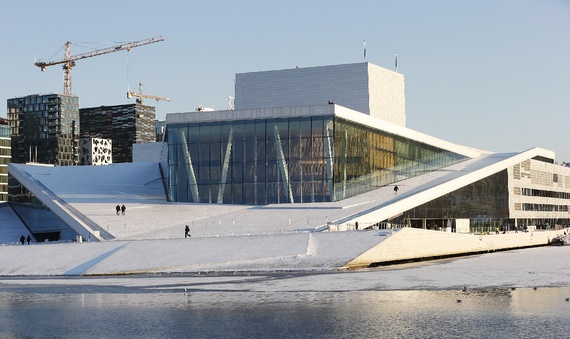
Fiji's new currency strays from people and celebrates its natural treasures. This is a much more interesting concept I find, The new currency used polymer notes for the £5. This is due to there climate the mix of hot, cold and rainy create a harsher than average condition for the note which results in more frequent wear and tear. something for me to consider could be climate.

“the neW series oF banknotes has
been reCeiveD extremely Well by
all Fijians. the Design Changes inCorporateD Fijian elements into
the banknotes anD they reFleCt Fiji’s oWn bioDiversity anD natural heritage – elements We are riCh in. We are extremely pleaseD With the positive FeeDbaCk We have reCeiveD.”

baRRY whiTesiDe 


The use of portrait pictures on banknotes and how they are created. 

Tuesday, 22 March 2016

OUGD406 - Studio Brief 2 - Screen print research


Caviar beads
A caviar bead is a glue that is printed in the shape of the design, to which small plastic beads are then applied – works well with solid block areas creating an interesting tactile surface.
Cracking ink
Cracking ink effect is when the ink produces an intentional cracked surface after drying.
Discharge inks
Discharge ink is used to print lighter colours onto dark background fabrics, they work by removing the dye of the garment – this means they leave a much softer texture. The cons with this process is that they are less graphic in nature than plastisol inks, and exact colours are difficult to control. One of the pros of using this process is they are especially good for distressed prints and under-basing on dark garments that are to be printed with additional layers of plastisol. It adds variety to the design or gives it that natural soft feel.
Expanding ink (puff)
Expanding ink, or puff, is an additive to plastisol inks which raises the print off the garment, creating a 3D feel and look to the design. Mostly used when printing on apparel.
Flocking
Flocking consists of a glue printed onto the fabric and then flock material is applied for a velvet touch.
Foil
Foil is much like flock, but instead of a velvet touch and look it has a reflective/mirror look to it. Although foil is finished with a heat press process it needs the screen printing process in order to add the adhesive glue onto the material for the desired logo or design.
Four-colour process or the CMYK colour model
Four-colour process is when the artwork is created and then separated into four colours (CMYK) which combine to create the full spectrum of colours needed for photographic prints. This means a large number of colours can be simulated using only 4 screens, reducing costs, time, and set-up. The inks are required to blend and are more translucent, meaning a compromise with vibrancy of colour.
Glitter/Shimmer
Glitter or Shimmer ink is when metallic flakes become an additive in the ink base to create this sparkle effect. Usually available in gold or silver but can be mixed to make most colours.
Gloss
Gloss ink is when a clear base laid over previously printed inks to create a shiny finish.
Metallic
Metallic ink is similar to glitter, but smaller particles suspended in the ink. A glue is printed onto the fabric, then nano-scale fibers applied on it. This is often purchased already made.
Mirrored silver
Mirrored silver is a highly reflective, solvent-based ink.
Nylobond
Nylobond is a special ink additive for printing onto technical or waterproof fabrics.
Plastisol
Plastisol is the most common ink used in commercial garment decoration. Good colour opacity onto dark garments and clear graphic detail with, as the name suggests, a more plasticized texture. This print can be made softer with special additives or heavier by adding extra layers of ink. Plastisol inks require heat (approx. 150 °C (300 °F) for many inks) to cure the print.
PVC and Phthalate Free
PVC and Phthalate Free is relatively new breed of ink and printing with the benefits of plastisol but without the two main toxic components. It also has a soft texture.
Suede Ink
Suede ink is a milky coloured additive that is added to plastisol. With suede additive you can make any color of plastisol have a suede feel. It is actually a puff blowing agent that does not bubble as much as regular puff ink. The directions vary from manufacturer to manufacturer, but generally up to 50% suede can be added to normal plastisol.
Water-Based inks
these penetrate the fabric more than the plastisol inks and create a much softer feel. Ideal for printing darker inks onto lighter coloured garments. Also useful for larger area prints where texture is important. Some inks require heat or an added catalyst to make the print permanent.
High Build
High Build is a process which uses a type of varnish against a lower mesh count with many coats of emulsion or a thicker grade of emulsion (e.g., Capillex®). After the varnish passes through to the substrate, an embossed-appearing, 'raised' area of varnish is created. When cured at the end of the process, the varnish yields a Braille effect, hence the term 'High Build'.

Sunday, 20 March 2016

Content - Studio Brief 2


For my content I originally decided to create a recipe sauce book however after researching into various cookbooks and magazines I decided I would like to create something with more depth but still incorporate recipes. I watched a 4 series documentary called cooked which was highly influential of my of my publication. It follows the theme of the four elements and the cooking relation to them, While showing how cooking is important you culture. It is based mainly around the usa as they are one of the worst country to pay companies to do there cooking. research shows europe is not as bad but this is still a big concern for generations to come. As cooking is becoming more and more microwave based. My publication does not actually focus on these negatives instead it simply Highlights the elements as being important methods within cooking. Then going onto some small informational parts and then a recipe for that particular element. To further my knowledge of this content I also read Cooked the book of the tv series. This goes into much more depth than the films and providing a whole range of interesting content. This was all great fun for me as cooking is a favoured hobby of mine which I love to learn about, I even made bread over easter through inspiration of the book, This is what i would like to invoke within people from my publication. I am aware that content within cook books to many people can seem dull and boring so I tried particularly hard to use the most interesting parts. The content focuses on fire, water, air and earth. Fire - started with a theory of how cooking with fire was the beginning of our evolution, then moving onto asados within south america, and started with a recipe for a sauce called chimichurri, This kept some of my original content within the publication. Water talks of pot cooking, and the importance of it. Along with a recipe for a traditional indian curry found within indian houses and food stall. Air speaks of the importance of bread within culture and moroccan culture, With a recipes to a more contemporary morcan flatbread. They final earth which focuses on fermentation a very interesting process which I learnt a lot about through this project. It tells the story of people within the amazon creating a alcoholic beverage through chewing and then to kimchi and the health benefits of eating fermented foods. I did extensive research into all thee topics a list of articles and websites is below.


Research - Studio Brief 1 - The gourmand


Okay, So for Studio Brief 2 I am creating a publication about sauces. I originally began to collecting content on sauces from different regions. I quickly found when putting this together It was stale and generic. I have decided I want to create a publication which flows from region to region telling stories of culture and information on cooking methods etc, with sauces inter winded within it. Influence for this came from the gourmand a food and culture journal. They do not focus the content souley on recipes it is more article on food culture with recipes towards the end. This makes for a much more interesting journal. I want my journal to inform people of diffrent cuisine, how the cuisine is cooked and what sauces go with this cuisine along with a small recipe card somewhere. As well as this I learnt a lot from the layouts within The gourmand. The gourmand uses a wide range of editorial effects throughout which I would like to consider within my publication such as inverting the body text having it bold and the subtitle regular. Overlapping text on images, changing fonts from page to page and diffrent layout of images, font As see below.


Monday, 14 March 2016

OUGD406 - Studio Brief 2 - Norways new currency

Norway's Innovative approach too both the passport and currency.


Call it more evidence of the endless commercialization of design; call it another reason to be thankful Norway never joined the Euro; call it kroner gone kreative. In any case, Norway's new banknotes, unveiled this week, are literally works of art. Norges Bank, the central bank of Norway, asked eight different designers to submit their proposals for the redesigned currency, to be put into circulation in 2017, and the winning design features images by Norwegian architecture firmSnøhetta on one side and Oslo-based graphic design firm The Metric System on the other.
Snøhetta, which has offices in Oslo and New York, has designed some of Norway's most iconic buildings, including the Oslo Opera House, a contemporary structure modeled after an iceberg that appears to seep into the Oslofjord below it.


Suzanne Plunkett/Reuters

The company is also currently working on the expansion of the San Francisco Museum of Modern Art and the reconstruction of Times Square, and recently finished the September 11 Memorial Museum Pavilion in New York. Its designs for the 50-, 200-, 500-, and 1000-kroner notes feature pixellated images of the Norwegian coastline distorted in accordance with the Beaufort wind scale—the 50 kroner note resembles a Pointillist painting, illustrated in small, even squares, while the 1000 kroner note depicts broad lines in deep shades of purple.


On the reverse side of the notes are more conventional designs incorporating both images traditional to Norway (a Viking ship, a lighthouse, and yes, even a fish) and the necessary watermarks and serial numbers.


Saturday, 12 March 2016

OUGD406 - Group meetings - Studio brief 3 - 2

Within our group meeting today we focus on getting to a concept which we could then progress with. We got a range of our favourite ideas together and had a crit with Simon on them. we explained we really wanted to focus on an experience and him suggested the vault - content unknown had great potential for this. However, he also thought there was potential in our traditional print idea. So we looked into ways of combining the two. We decided on following through with the vault idea and focusing on creating mystery behind the idea working alongside aspects of traditional print.


Chloe and Stephen also draw up our contracted which we was all assigned roles to however we agreed these would be vague positions and we would be working together on everything. I was assigned layout/design which fitted to my current research. 


Wednesday, 9 March 2016

OUGD406 - Research - Studio brief 3

An example of much larger scale advertising. 


A quick exhibition branding with used th idea of post-its. The exhibition is process driven due to the low amount of time. 


Really nice approach to a playful exhibition making use of cargo containers was a real nice touch. 


New Year Graphics for Sejong Cente 
A nice idea of painting the outside of the building


I love the use of the over sized c. This project made me realise I need to be aware of how my stuff will scale etc. 


A wonderfull exhibition design, Got me really thinking about who the work within the exhibition will be hung up etc. 


The idea of using half tonnes as pattern branding informed through screen printing


What I have noticed between exhibition branding is that a lot seem to use big bold colour this i rproably to catch attention easily. This is something I will take into consideration. In addition to this there always seems to be some kind of pattern run throughout, that could be the use of cargo holders, post it notes or literally a pattern. 

This has given me ideas of using big bold forms swell as patterns throughout. 


Tuesday, 8 March 2016

OUGD406 - Group meetings - Studio brief 3 - 1

Today we was put into groups of 6 we started by brainstorming together, and came up with a range of ideas. We looked at research, target audience, jobs, advetising, social media and concepts. We instantly figured how we put people to come to the event was an important part we wanted this to work in connection with social media. Are main focus was professionals but we also wanted to take advantage of living in a city of students so decided to think of ways we could get students from outside of college interested. Our concepts where to focus on what people spend there money on, a all traditional approach which could of used a range of methods to create posters etc, having a theme of a bank vault which inside had unknown content to build on mystery within the exhibition and a focus on an experience so a bank robbery for example. we also looked at areas we could all research into I was given exhibition layouts and branding, and this is when the project began for us.


Monday, 7 March 2016

OUGD406 - Studio Brief 2 - Feedback

Crit feedback pointed out my stronger concepts. These being fun coupons, market currency and -money. I have decided to then expand on these three more.

Firstly with market currency. Feedback suggested to make it a united kingdom thing rather than a regional currency. At first I was wary but then realised this actually makes a lot of sense as it would create a economy within the markets and help building up smaller farms. This project would link into the livelihoods of farmers aswell as the take into consideration the amount of population large scale animal agriculture uses. This is due to supermarkets demanding cheaper product resulting in larger animal agriculture. 

Secondly the fun coupon idea was picked out as a strong response. I really like the idea of this one simply due to the fact I feel i can play around with it a lot. Use diffrent illustration styles, design styles etc. Taking influence from holidays and wolf of wall street. 

Lastly is the idea of dept and - money how although we have £10 likely hood is we own that back in dept, this could relate to usa dept, where the dept currency is 10% higher than the currency in cumulation or it could relate to student dept, with overdrafts and loans. For this I could combine it with my idea of being contemptry print, using as many processes as possible. 


Friday, 4 March 2016

OUGD406 - Studio Brief 2 - Research - Euro Changes

The new euro notes have used feel, tilt and look to produce something more secure these are all aspects i will keep in mind when creating my own bank notes. I started to look at how the new euro bank notes have changed, they have added a raised pattern down the side for additional security features this also, I would like to use the letter press to add feel to my bank note. Tilting the note reveals hidden information this is something I can look into but not nessarily do. The light also has affects which would look great but sadly would be very difficult for me to do.