


Call it more evidence of the endless commercialization of design; call it another reason to be thankful Norway never joined the Euro; call it kroner gone kreative. In any case, Norway's new banknotes, unveiled this week, are literally works of art. Norges Bank, the central bank of Norway, asked eight different designers to submit their proposals for the redesigned currency, to be put into circulation in 2017, and the winning design features images by Norwegian architecture firmSnøhetta on one side and Oslo-based graphic design firm The Metric System on the other.
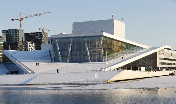
Snøhetta, which has offices in Oslo and New York, has designed some of Norway's most iconic buildings, including the Oslo Opera House, a contemporary structure modeled after an iceberg that appears to seep into the Oslofjord below it.
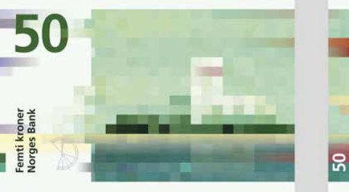
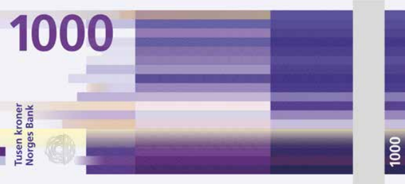
The company is also currently working on the expansion of the San Francisco Museum of Modern Art and the reconstruction of Times Square, and recently finished the September 11 Memorial Museum Pavilion in New York. Its designs for the 50-, 200-, 500-, and 1000-kroner notes feature pixellated images of the Norwegian coastline distorted in accordance with the Beaufort wind scale—the 50 kroner note resembles a Pointillist painting, illustrated in small, even squares, while the 1000 kroner note depicts broad lines in deep shades of purple.
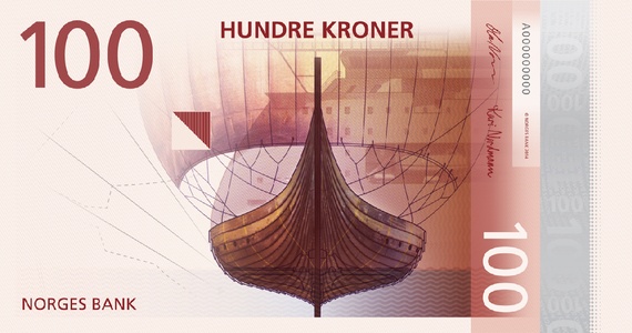
On the reverse side of the notes are more conventional designs incorporating both images traditional to Norway (a Viking ship, a lighthouse, and yes, even a fish) and the necessary watermarks and serial numbers.
No comments:
Post a Comment