First I tested two different typefaces, sporting and young serif. Young serif suited the branding a lot better. This stock was actually to thick, so I used a thinner one next. labels originally were also stuck down with double-sided tape. There was no stickers on these mock ups.

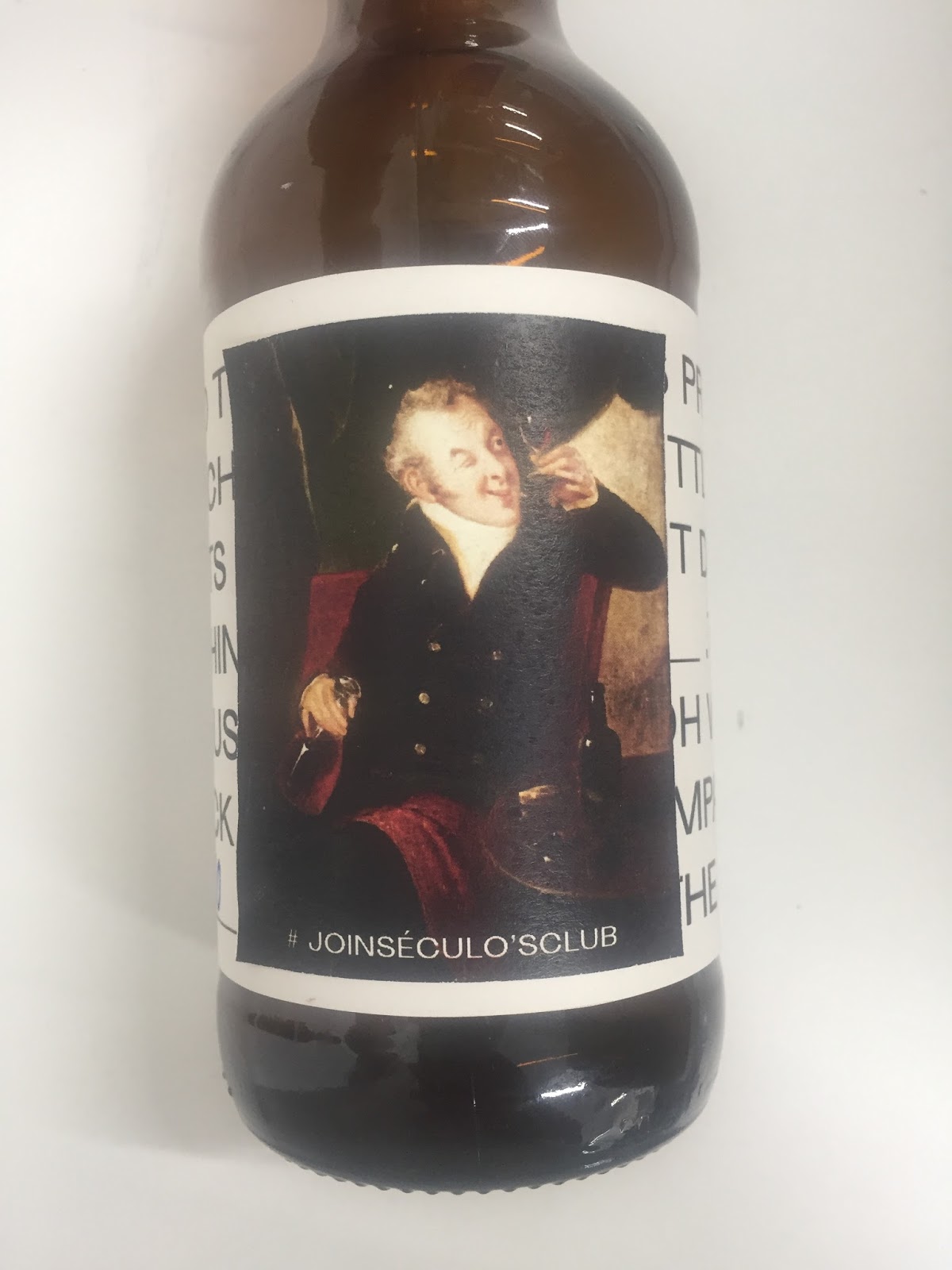


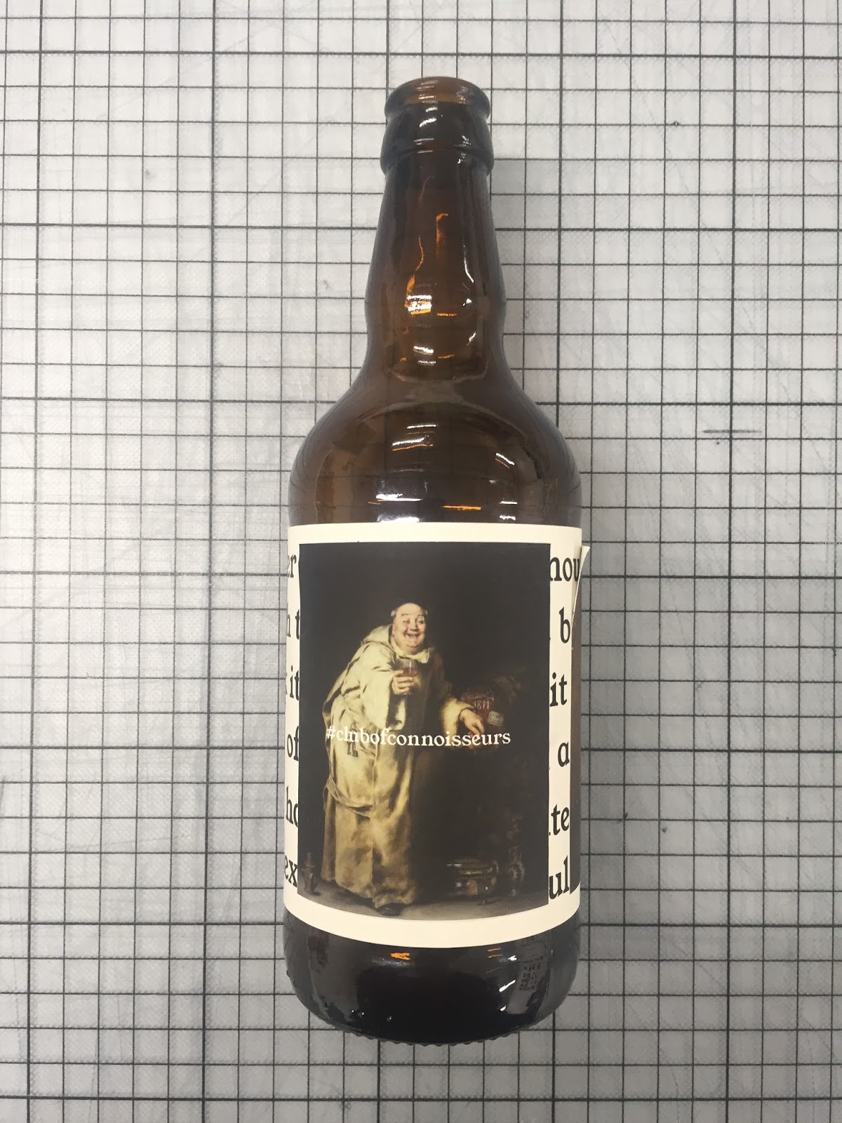


I think next time to solve some issues I would have to get rid of the text underneath and just use the stickers as the labels.
No comments:
Post a Comment