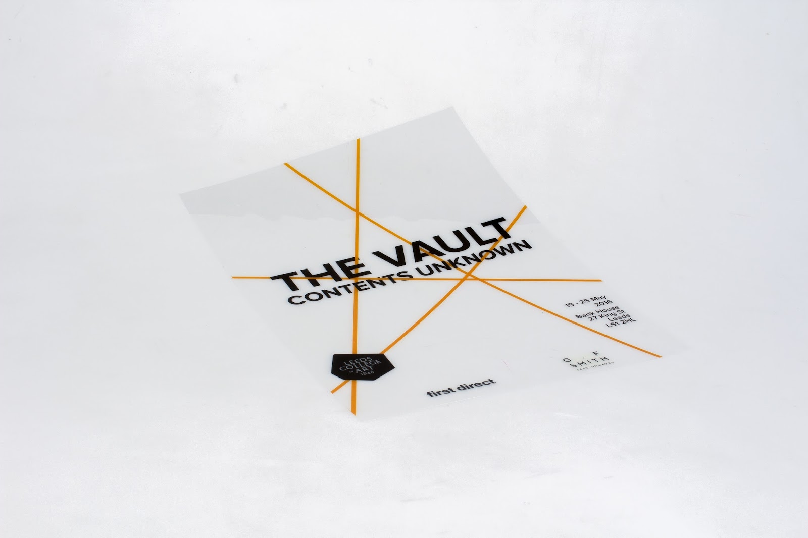
So I tryed to screen print my final posters. I really underestimated how difficult it would be and the amount of time it would take. I found that a3 is a lot more difficult to get right when printing. I only had time to print one peice and it didn't come out how I would of liked so in the end I digital printed as I wanted them to work at a series but here is my screen printed attempted. The it's behind these posters is to help internationals and people from different areas to understand a few words they may not know. It is ment to be fun and playful not to informal. I used hold colours informed through me this initer design and the design instelf is informed by post modernism. I chose this style as I find post modernist design to be the most engaging Memphis stands it particularly and would really brighten up the studio space.
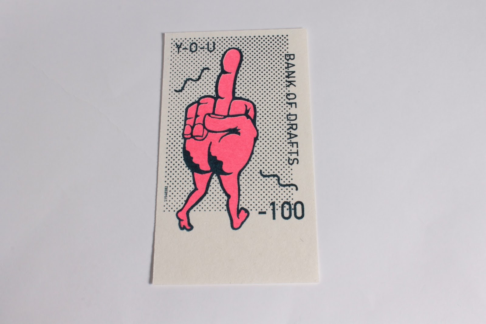
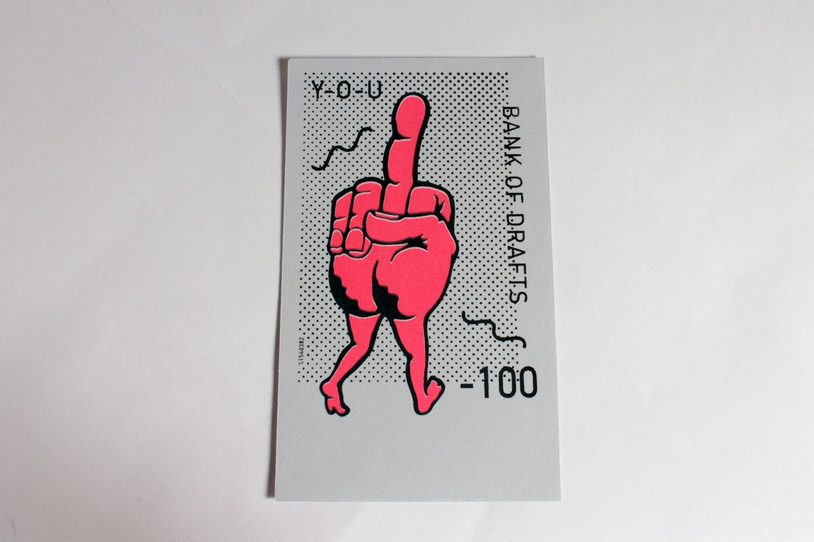
For this module I have really tried to pay attention to photography and photographing all my work. I found it was much more important than I thought at the begining of the year. It is also really enjoyable and is something I like to try and improve in as im still relatively new to photographing products.


